INTERACTION

Countess˘î Cell Counter
Songwriting Responsive Design
MasterWriter

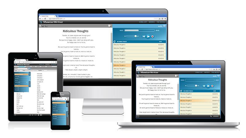
Responsive design allowed for streamlined overhaul of this market-leading songwriting software. I proposed a new layout paradigm for the software allowing the user to work with songlist, lyrics, audio and word searches in parallel.

I explored usability requirements with for a wide range of screen sizes using low and high fidelity mockups and delivered final layouts and specs to developers in HTML and CSS.

Client/SME: Barry DeVorzon, Matthew DeVorzon and Micheal Towers. User flows, wireframes, prototypes and final HTML mockups: Lydia Jablonski. Development: SoftVision
Countess˘î Cell Counter
WordXpress Educational Software
MasterWriter

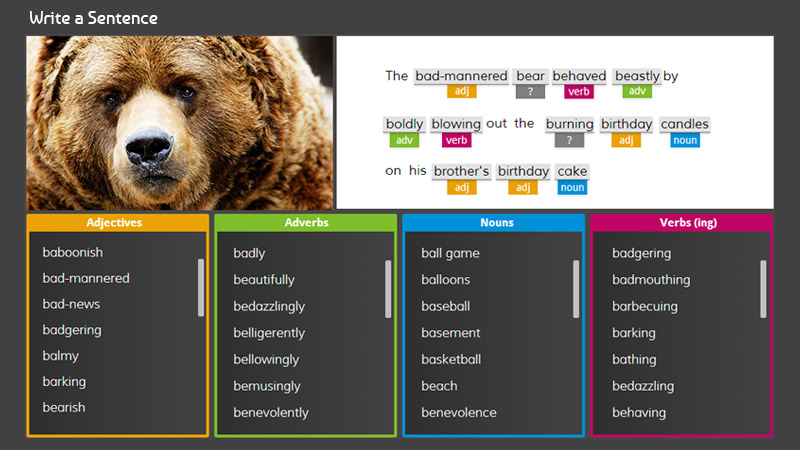
Web-based educational software. This vocabulary builder uses simple exposure and trial and error to teach new words. Carefully chosen web fonts put an emphasis on typography so the words become the star. Reponsive layout works on desktop and tablet.

Client/SME: Barry DeVorzon, Matthew DeVorzon and Micheal Towers. User flows, wireframes, prototypes and final HTML mockups: Lydia Jablonski. Development: SoftVision
Countess˘î Cell Counter
Countess˘î Interactive Demo
Invitrogen

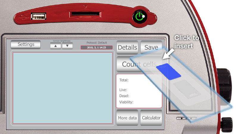
This interactive demo guides the user through the core functions of the Countess Automated Cell Counter.

A challenge was the integration of three different interface "worlds": the software interface (touchscreen), hardware interface (slide slot, USB port) and laboratory bench top. On top of this, on-screen instructions are needed to help user proceed through the demo.

Client/SME: Wenlan Hu and Krissy Remple. Graphics: Lydia Jablonski (lead) and Kelly Christensen. Flash application: Lydia Jablonski.

Qubit˘î Fluorometer
Qubit˘î Virtual Demo
Invitrogen

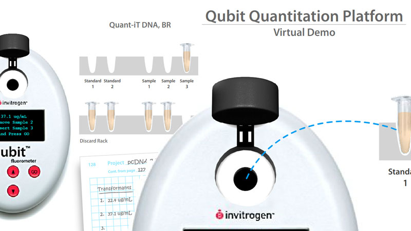
The Qubit Fluorometer is a benchtop instrument used to quantitate proteins, RNA and DNA in molecular biology labs. The Qubit Virtual Demo is a self-contained Flash application created for potential Qubit customers to allow them to explore the functions of the Qubit.

Client/SME: Jill Hendrickson. Graphics: Lydia Jablonski (lead) and Kelly Christensen. Flash application: Lydia Jablonski.

Cell Staining Simulation Tool - Stain Your Own Cell
Cell Staining Prototype
Invitrogen

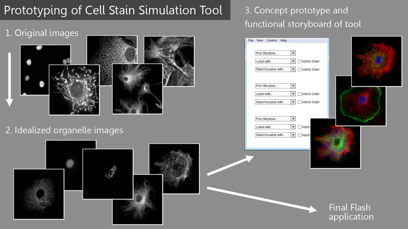
This project was a prototype of a prototyping tool: an online tool for our customers to pre-visualize a multicolor cell staining experiment and then be able to select the products they used for purchase. To explore how this might look, I started with micrographs of many different cells and composited examples of each organelle type so they all would fit into the same idealized cell. Although these images were only intended for my simple Flash prototype, they were all used in the final application.

Client/SME include: Beth Browne, Magnus Persmark, Johnathan Young. Cell imagery and prototype application: Lydia Jablonski. Final application: William Grand.


Poking Things

Poke things. Have fun. See what happens. Make them break. If your users are really having fun, expect them to always be on the verge of breaking your stuff.

Being on the other side of interaction design is mind-boggling. The more fuctionality you add, the more likely it is to break. You could spend your whole life worrying about the software/hardware compatibility before you even look at what the humans are doing.

But the humans are the most important and most facinating part of the design. Verbal feedback on an animation or illustration only goes so far. So much can be learned by watching someone interact with an application, a prototype or even a storyboard.

Because of this, I make interactivity part of my design process and my communictation with clients even on my non-interactive projects. Storyboarding and rapid prototyping are effective because of their mutability and their lack of preciousness. And with these, it is important to play, knock them over, and make them break. Again and again.